-
×
 Affiliate Marketing Secrets - Iman Shafiei
2 × $91.00
Affiliate Marketing Secrets - Iman Shafiei
2 × $91.00 -
×
 2-Day Intensive Training: Shame, Guilt and Self-Criticism Certificate Course - Pavel Somov
2 × $124.00
2-Day Intensive Training: Shame, Guilt and Self-Criticism Certificate Course - Pavel Somov
2 × $124.00 -
×
2010 Edition – Market Analysis [Software (WIN)] – Timing Solution Advanced
6 × $232.00
-
×
10X Secrets Masterclass - Russell Brunson
5 × $102.00
-
×
10 Steps to Greater Confidence and Self-Esteem - Alexis Meads
2 × $42.00
-
×
"Fix My Job" binaural mantra meditation for attracting work you love - Michael Davis Golzmane
2 × $17.00
-
×
007s Guide to a Womans Heart – Elite Training Bundle
2 × $35.00
-
×
"Is Your Soul Allowing You To Heal?" -- All 7 Recordings in the Series (6 Hours of Audio Clearings)
2 × $83.00
-
×
Gina DeVee - Life Purpose Project LIVE
1 × $75.00
-
×
$100K Academy – Charlie Brandt
3 × $63.00
-
×
Activate Your Diamond Blueprint - Diamond Energy - Jacqueline Joy
3 × $37.00
-
×
Opening the Golden Door of Sacred Geometry
2 × $79.00
-
×
Legal Risks for Nurses: Protect Yourself from the Courtroom! - Rachel Cartwright-Vanzant
5 × $44.00
-
×
123 Affiliate Marketing - Patt Flynn
1 × $64.00
-
×
(ROI Optimization) Source ROI by OMG SEO expert Alex Becker
4 × $73.00
-
×
2-Day: Trauma Treatment Certificate Course: Comprehensive Strategies and Customizable Interventions for Enhanced Recovery - Robert Lusk
2 × $204.00
-
×
12 Minute Stage Crazy - Body of a Rock Star
2 × $22.00
-
×
$200k Book Blueprint Training – Richelle Shaw
3 × $96.00
-
×
66 Texts - Andrew Ryan
1 × $30.00
-
×
1-2-3 Magic: 3-Step Discipline for Calm, Effective and Happy Parenting - Thomas W. Phelan
3 × $84.00
-
×
12 Week Teleseminar Intensive - Noah St John
1 × $60.00
-
×
10x Launches - Copy hacker - Ry Schwartz
4 × $92.00
-
×
3 Clearings in 1! Communication, Wealth, and Intimacy - Michael Davis Golzmane
2 × $30.00
-
×
10 Million Dollar Marketing Secrets - Dan Kennedy
3 × $45.00
-
×
Command Z - Esozone Codex Brain Change Course
2 × $42.00
-
×
Qi Medicine - Dr. Roger Jahnke, OMD
5 × $92.00
-
×
Affiliate Millionaires 3.0 2017 – Greg Davis
3 × $139.00
-
×
Shapeshifting Your Reality - John Perkins
1 × $92.00
-
×
10 Steps to Learn Anything Quickly - John Sonmez
1 × $104.00
-
×
1 Lead A Day - Bryan Kreuzberger
2 × $103.00
-
×
Legal and Regulatory Issues in Wound Care: Avoid Wound Issues and Keep Yourself Out of Court - Heidi Huddleston Cross
2 × $85.00
-
×
Advanced Mindfulness Techniques that Change the Brain: Rewire Depression, Anxiety and Toxic Lifestyle Habits - Donald Altman
1 × $84.00
-
×
"True Bee" Sittepute - Kru Bee Clinch Wizard - Kru Moonkondech
3 × $25.00
-
×
123 Manifest It - Marlenea Johnson
1 × $152.00
-
×
6 Figure E-Commerce Formula – Patrick Malone
2 × $87.00
-
×
$8K Per Day Formula - Chris Record
3 × $43.00
-
×
12 Dimensions of Mastery (Lifebook Challenge)
2 × $92.00
-
×
Addressing Patient Behavior by Brain Lesion Site: Clinical Tools and Strategies Specific to Patient Deficits - Jerome Quellier
1 × $85.00
-
×
10 Dollar Time Bomb VIP – Ben Adkins
6 × $44.00
-
×
Skin & Wound Care - Heidi Huddleston Cross
5 × $85.00
-
×
Avoid Nursing Risk: Documentation, Practical Ethics & Legalities - Kathleen Kovarik & Rosale Lobo
8 × $105.00
-
×
101 Practical Strategies for the Treatment of GAD, Panic, OCD, Social Anxiety Disorder, Phobias and Insomnia - Jennifer L. Abel
1 × $124.00
-
×
Battlefield Kali Sword - JKD Unlimited
1 × $49.00
-
×
6 Figure Funnels Normal – Jane Copeland
3 × $94.00
-
×
Autoresponder Alchemy
3 × $34.00
-
×
1K A Day Challenge – Build a $1K A Day Affiliate Business FROM SCRATCH – Duston McGroarty
1 × $62.00
-
×
$0 to $100,000 on Amazon (Premium Live Training) – Matt Clark and Jason Katzenback
4 × $193.00
-
×
10 Photoshop Retouching Courses In - 1 Course - Manfred Werner
2 × $40.00
-
×
0-100K Case Study – Grant Ambrose
3 × $123.00
-
×
“Done-For-You” Client-Attraction Teleseminar Package – Michelle Schubnel
1 × $80.00
-
×
12 Major Candlestick Signals - Stephen W.Bigalow
1 × $45.00
-
×
0-6 Pack Abs Phase 1 &2 - Tyler Bramlett
5 × $17.00
-
×
3-Day: Vestibular Rehabilitation Intensive Training Course - Jamie Miner
1 × $244.00
-
×
100 Days to $100k – PPL Army
1 × $64.00
-
×
2017-2018 Certificate Program in Traumatic Stress Studies
2 × $363.00
-
×
[$10] EDUmobile Academy - Premium Course Bundle
1 × $83.00
-
×
Tax-Free Zone Video Course - America
1 × $79.00
-
×
Activate the Consciousness to Receive the One Thing that Seems to Be Missing From Your Life (Vishnupati, November 2019) - Michael Davis Golzmane
2 × $30.00
-
×
10x Formula Intensive Training – Lee McIntyre
3 × $59.00
-
×
8x Hero Academy – Alex Becker
4 × $94.00
-
×
Business Giveaway Machine – Coaching Program - Carl Allen
3 × $85.00
-
×
1 hour Yoga class for beginners - Alex Genadinik
3 × $42.00
-
×
14-Day Options Trading Bootcamp (Jule 2014) – Sang Lucci
1 × $50.00
-
×
10 Second Sexual Attraction 2.0 – Mehow
1 × $42.00
-
×
‘The Iceman’ 10-Week Video Course – Wim Hof Method
2 × $35.00
-
×
'MAGNETIC INFLUENCE' - Magnet for Money, Charisma, Confidence! - Dani Johnson
3 × $63.00
-
×
Quantum Dreaming - Robert Moss
2 × $222.00
-
×
10x Emails Mastery - Joanna Wiebe and Ry Schwartz
1 × $154.00
-
×
[BIG Collection Real Estate] Real Estate Web Academy – Great Real Estate Giveaway
1 × $88.00
-
×
2-Day Cardiac Essentials Conference: Day Two: The Core Cardiac Competencies - Cynthia L. Webner
2 × $85.00
-
×
0-100k Case Study from Grant Ambrose
1 × $95.00
-
×
Code 2 Conversions - Chris Rocheleau
1 × $135.00
-
×
100 Brain-Changing Mindfulness Techniques to Integrate Into Your Clinical Practice - Debra Burdick
3 × $84.00
-
×
$1K A Day Fast Track – Merlin Holmes
2 × $123.00
-
×
ONE Flip - 8 Figure Investor - Josh Cantwell
1 × $100.00
-
×
Advanced Strength and Power - Dan Baker
3 × $42.90
-
×
$42000 Mastermind Manuscript 2008 - Rich Schefren
1 × $23.00
-
×
CBT Toolbox for Children and Adolescents
3 × $84.00
-
×
10th Planet Jiu-jitsu All Stars
2 × $27.00
-
×
Advanced Killer Chicken Wings - Erik Paulson
1 × $34.90
-
×
33 Magic Moves - Tripp
1 × $49.00
-
×
MyBeliefworks™ for Increasing Psychic Intuition - Jimmy Mack
1 × $34.00
-
×
1-Hour Home Selling Machine – Wolff Couple
2 × $293.00
-
×
“Email Response Warrior + Email Inbox Warrior” – Jason Henderson
2 × $78.00
-
×
10 Activities to Enhance Social-Emotional Literacy in the Classroom: Transform Student Behavior from Chaos to Calm - Lynne Kenney
4 × $19.00
-
×
1% Better Every Day Strength Building System - Ricky Lundell
2 × $32.00
-
×
2017 GrowthHackers Conference Virtual Pass - Growth Hackers
1 × $70.00
-
×
10 Ways to Make Money with Your Blog – John Sonmez
3 × $29.00
-
×
“The Beast” Automated Trading System V2 (Feb 2015)
1 × $36.00
-
×
#1 Professional Email Signature Creation: Photoshop to HTML - Marty Englander
1 × $15.00
-
×
21 Days to an Effective Yoga Handstand - Kino Macgregor
3 × $52.00
-
×
Attachment in Adults: How Infant Attachment Security Affects Adult Relationships - Onno van der Hart , Linda Curran , Mary Lou Schack & ...
5 × $38.00
-
×
10x Emails Comprehensive – Copy Hackers
2 × $45.00
-
×
10 MILLION DOLLAR SECRETS (CD and MANUALS) - DAN KENNEDY
2 × $19.00
-
×
Complete Ericksonian Hypnosis – Beginners course
5 × $80.00
-
×
Advanced Kinesiology Taping Practitioner Certification - Aaron Crouch
2 × $85.00
-
×
Affiliate Millionaires 2017 - Greg Davis (Super Affiliate Rockstar Live + Bonus)
2 × $147.00
-
×
15 Must-Have Mindfulness Techniques for Clinicians: Skills to Transform Your Treatment Plans for Stress, Depression, Anxiety, Anger, Trauma, Guilt and Shame - Terry Fralich
1 × $84.00
-
×
MyBeliefworks for Changing Beliefs About Work, Job, Career - Jimmy Mack
1 × $34.00
-
×
Management of the Burn Patient - Dr. Paul Langlois
1 × $35.00
-
×
Managing Patient Emergencies: Critical Care Skills Every Nurse Must Know - Dr. Paul Langlois
1 × $85.00
-
×
Advanced Arduino Boards and Tools
1 × $20.00
-
×
10 Best-Ever Anxiety Treatment Techniques - Margaret Wehrenberg
1 × $164.00
-
×
6 Week Affiliate Mastery Challenge 2015 (GB)
3 × $252.00
-
×
(Bundle) Pindepth: Advanced Pinterest Marketing for Business - Kayla M. Butler
1 × $44.00
-
×
2017 Food Revolution Summit Empowerment Package – Ocean Robbins
2 × $34.00
-
×
All Things Cardiac: Evidence-Based Approaches to Manage Any Situation - Cyndi Zarbano
1 × $85.00
-
×
Opening Your Third Eye - Raja Choudhury
1 × $54.00
-
×
2-Day: Chronic Pain Certificate Course: Behavioral Treatment & Assessment - Robert Rosenbaum
1 × $124.00
-
×
Advanced Concepts in Cardiovascular Care 2-Day Conference: Day One: Advanced ECG & Arrhythmia Interpretation - Karen M. Marzlin
1 × $85.00
-
×
$100k Social Workshop
1 × $43.00
-
×
ACPARE - Funds vs. joint Venture Structures Mastery
1 × $86.00
-
×
Pain Management in the Elderly - Steven Atkinson
1 × $35.00
-
×
1 Hour SEO | Become a Technical Marketer
1 × $40.00
-
×
7 Practices to Greatly Improve Your Brain - Jonathan Jordan
2 × $29.00
-
×
MyBeliefworks for Positive Money Mindset - Jimmy Mack
2 × $37.00
-
×
Managing Patient Emergencies - Robin Gilbert
1 × $85.00
-
×
'Quantum' Chakra Clearing and Balancing Series - Jonette Crowley
2 × $52.00
-
×
10x Wealth and Business New – Brendon Burchard
1 × $123.00
-
×
Funds vs. joint Venture Structures Mastery - ACPARE
2 × $90.00
-
×
Integrated Chronic Pain Management: Mental Health Interventions that Counteract Opiate Addiction - Robert Umlauf
1 × $85.00
-
×
Spanish for HealthCare Professionals: Intensive Online Course - Tracey Long
1 × $65.00
-
×
Optimizing The Brain - TTC Audio
1 × $43.00
-
×
5 Proven Ecommerce Scaling Tactics
2 × $49.00
-
×
Copywriting For Creatives - Ashlyn Carter
1 × $24.00
-
×
Teach Yourself - Vietnamese
1 × $17.00
-
×
2-Day All Things Pulmonary - Cyndi Zarbano
1 × $125.00
-
×
3-Day: Comprehensive Training in Women's Health: Today's Best Practices for Improving Recovery and Outcomes - Debora Chasse
1 × $244.00
-
×
NeuroKinetic Therapy - Level 1 - David Weinstock
1 × $23.00
-
×
10 Brain-Based Strategies: Help Children Overcome Anxiety and Promote Resilience - Tina Payne Bryson
1 × $29.00
 "Fix My Job" binaural mantra meditation for attracting work you love - Michael Davis Golzmane
  007s Guide to a Womans Heart – Elite Training Bundle
  "Is Your Soul Allowing You To Heal?" -- All 7 Recordings in the Series (6 Hours of Audio Clearings)
  Gina DeVee - Life Purpose Project LIVE
  $100K Academy – Charlie Brandt
  (ROI Optimization) Source ROI by OMG SEO expert Alex Becker
  $200k Book Blueprint Training – Richelle Shaw
  1 Lead A Day - Bryan Kreuzberger
  "True Bee" Sittepute - Kru Bee Clinch Wizard - Kru Moonkondech
  $8K Per Day Formula - Chris Record
  $0 to $100,000 on Amazon (Premium Live Training) – Matt Clark and Jason Katzenback
  0-100K Case Study – Grant Ambrose
  “Done-For-You” Client-Attraction Teleseminar Package – Michelle Schubnel
  12 Major Candlestick Signals - Stephen W.Bigalow
 ![[$10] EDUmobile Academy - Premium Course Bundle](https://utralist.com/wp-content/uploads/2021/05/EDUmobile-Academy-Premium-Course-Bundle-247x296.jpg) [$10] EDUmobile Academy - Premium Course Bundle
[$10] EDUmobile Academy - Premium Course Bundle  ‘The Iceman’ 10-Week Video Course – Wim Hof Method
  'MAGNETIC INFLUENCE' - Magnet for Money, Charisma, Confidence! - Dani Johnson
  Code 2 Conversions - Chris Rocheleau
  $1K A Day Fast Track – Merlin Holmes
  $42000 Mastermind Manuscript 2008 - Rich Schefren
  33 Magic Moves - Tripp
  “The Beast” Automated Trading System V2 (Feb 2015)
  #1 Professional Email Signature Creation: Photoshop to HTML - Marty Englander
  (Bundle) Pindepth: Advanced Pinterest Marketing for Business - Kayla M. Butler
  $100k Social Workshop
 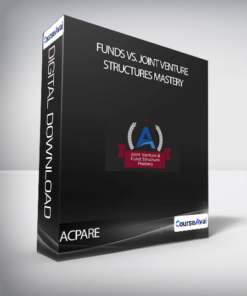 ACPARE - Funds vs. joint Venture Structures Mastery
 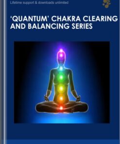 'Quantum' Chakra Clearing and Balancing Series - Jonette Crowley
  10x Wealth and Business New – Brendon Burchard
 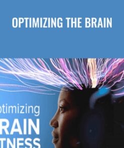 Optimizing The Brain - TTC Audio
  Copywriting For Creatives - Ashlyn Carter
 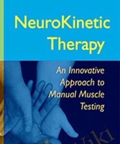 NeuroKinetic Therapy - Level 1 - David Weinstock
 You may be interested in…
-
Add
 21 Day Inner Healing Journey - Jimmy Evans
Original price was: $29.00.$20.00Current price is: $20.00.
21 Day Inner Healing Journey - Jimmy Evans
Original price was: $29.00.$20.00Current price is: $20.00.