
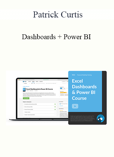

In this module, we use 6 video lessons to explain the key components and best practices when creating an Excel dashboard. This includes a step-by-step walkthrough of a company sales dataset and an explanation of important metrics pertinent to our case study.
In this module, we use 7 video lessons to provide a walkthrough on how to modify our dataset to create several key charts and indicators in our Excel dashboard. We wrap up this module by exploring Combo Charts, an efficient and dynamic way of comparing data.
In this module, we use 8 video lessons to expand upon the charts we created in previous modules by adding Dynamic Charts and Net Promoter Score (among other topics). This module also includes a tutorial on how we can use dynamic coding to make our data malleable and conditional formatting to provide visually appealing dashboards.
In this module, we use 2 video lessons to tie together the different charts we have created in previous modules, using the dashboard to provide conclusive data that can be presented. We wrap things up by offering several tips to continue improving on your Excel Dashboards.
In this module, we use 5 video lessons to dive into Power BI, a tool that provides additional customization and filters that are not available in Excel. This includes a brief overview of Power BI functionality, customizable slicers, and automatable data linking and sorting.
In this module, we use 5 video lessons to explore column charts, pie charts, and bar charts and how to fully use Power BI to create dynamic visualizations. We wrap up this module by learning how to use slicers to control interactions between different charts.
In this module, we use 7 video lessons to dive deeper into more advanced visualizations such as Filled Map Visualizations, Scatter Plots, and Funnel Charts. This module also includes a step-by-step walkthrough on how to create these visualizations.
In this module, we use 2 video lessons to explore the special features of Power BI online such as interconnectivity with clients. We wrap up this module by exploring insights and correlations that Power BI is able to autonomously generate using your data.
Below you will find a list of the modules and lessons included in this course.